INFOGRAPHIC DESIGN PROCESS
Why work with a designer on an infographic?
Infographics are a great way to quickly convey a lot of information. Unlike a wall of text, people can engage with them at different levels. At a quick glance, you should be able to get a sense of the overall idea and mood. Looking closer, you can quickly get a high-level understanding through headers and images, and those with an interest in the content can read descriptions to get more detail. A designer can come up with engaging ways of translating your information visually and can help guide you through the process.
What is our process for infographic design?
I’ll use two infographics as examples. I created both of these for The Neighborhood Developers, an affordable housing nonprofit based in Eastern Mass.
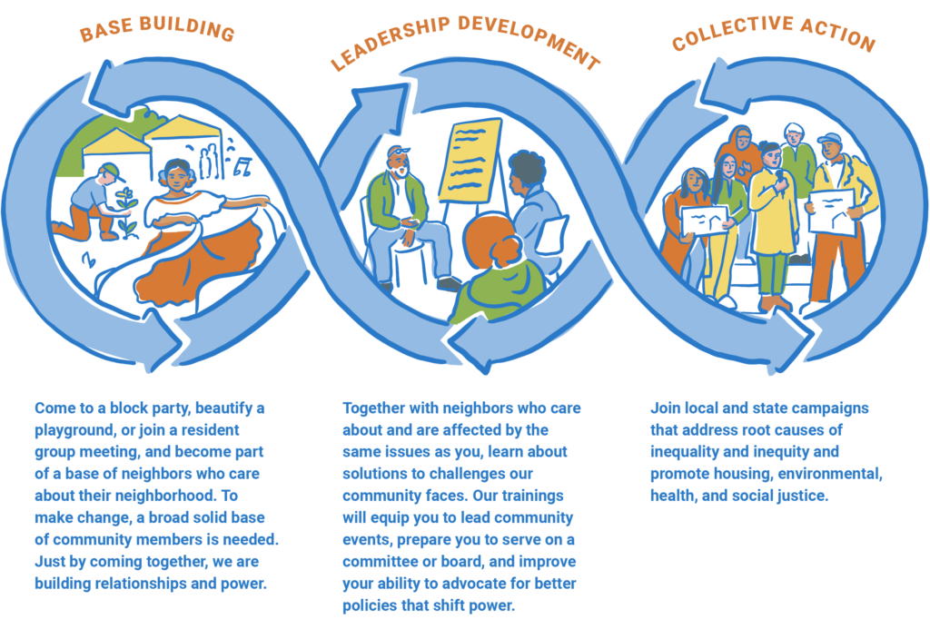
Community Building Infographic
The first step, as in every project I work on, is to understand the communication needs of the client and project. What is the main objective? Who is the infographic for? What is the tone? What content has already been gathered?
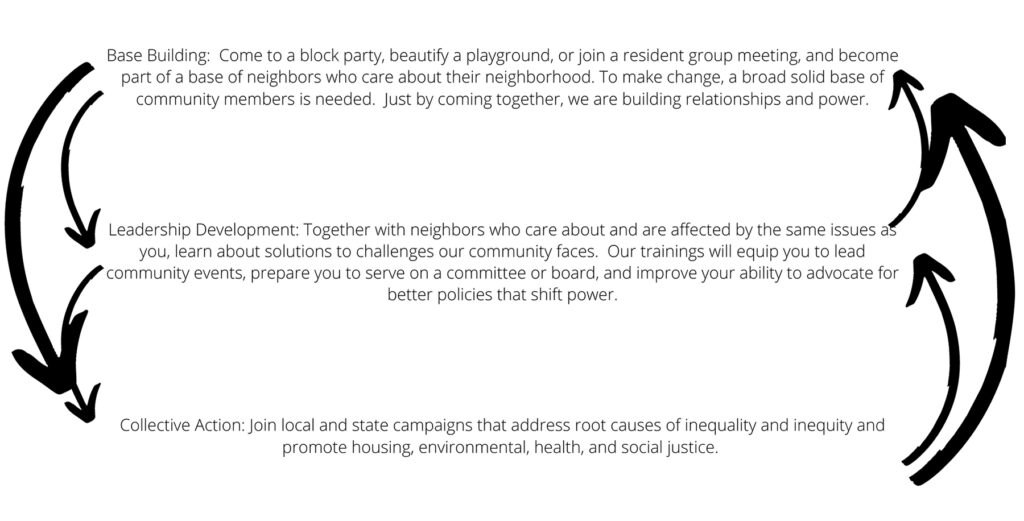
The goal of this infographic was to show TND’s approach to community building. The graphic was for their website, grant applications, and some direct community work. After our initial call, TND shared the text that they’d pulled together. It was really important to them that the graphic didn’t feel hierarchical with one aspect of their work looking more important than the others.
The initial reference content is below. It’s not very exciting to look at yet!
Next, I created two sketches based on TND’s content and objectives. Since I’d already developed an illustration style for TND through their brand refresh, I knew this infographic would have a loose, friendly feel. For projects without an established style, I add a step to align on the visual mood with the client through mood boards or two stylistic directions. More on that another time! Here are the two sketches I shared:
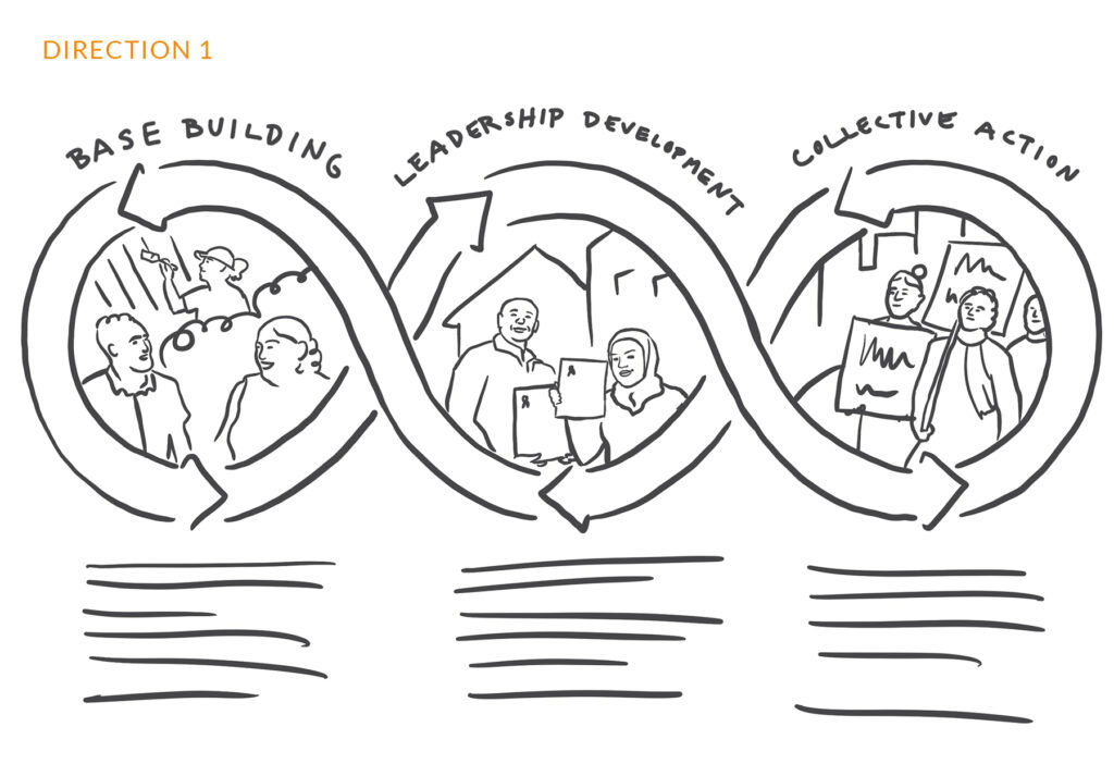
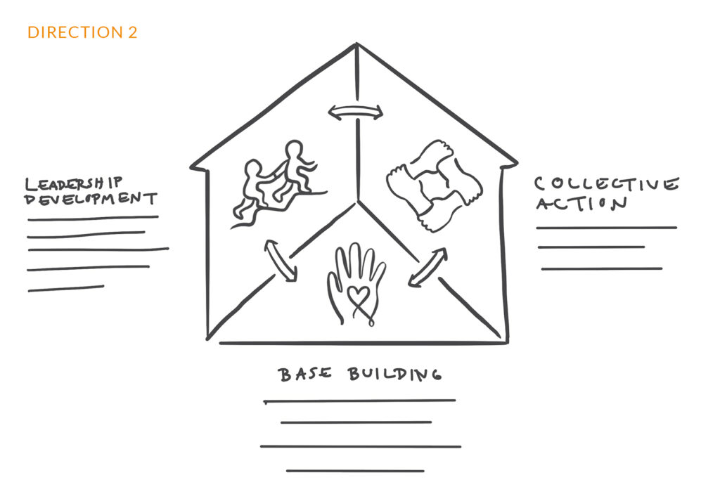
The client chose the first direction because it conveyed more about the kinds of activities they are involved in. There was a little back and forth about the details of some of the scenes, and the client provided some reference photography from their work. Basing the illustrations on actual photography helped it feel more specific to them.
Here is the final version:
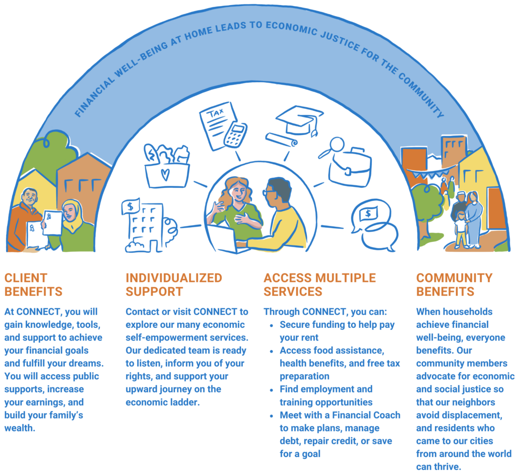
CONNECT Infographic
The second example is an infographic I made about CONNECT, an aspect of TND’s work in which they connect residents to services including employment resources, income supports, etc. The rough content shared for this graphic was more complex, as you can see below:
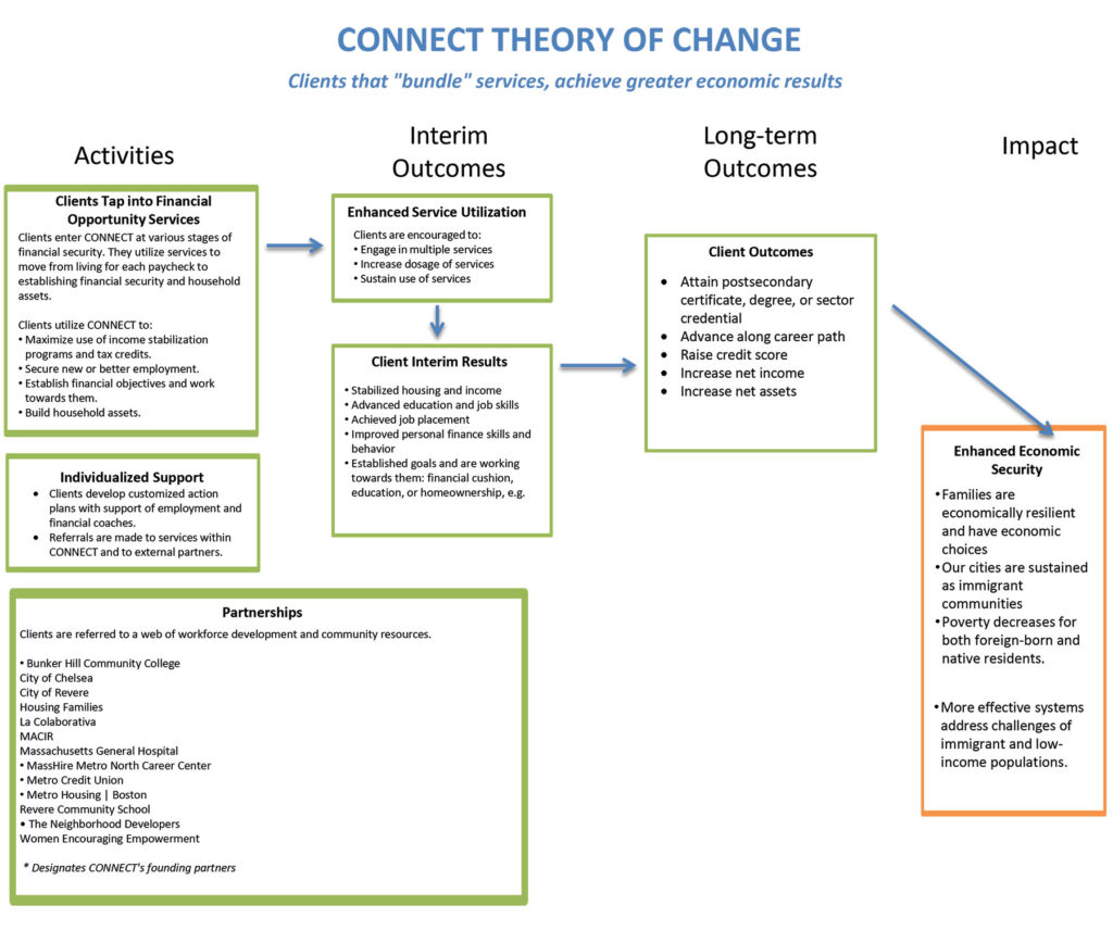
After our initial discussion, the client agreed that the rough content needed the overall message clarified. It also needed to be simplified and word-smithed. With that in mind, I created two sketches that emphasized different aspects of their content.
Here are the two initial sketches:
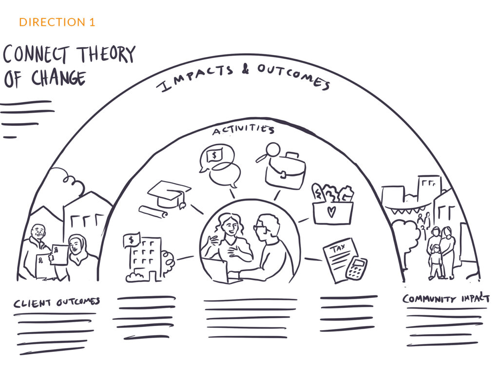
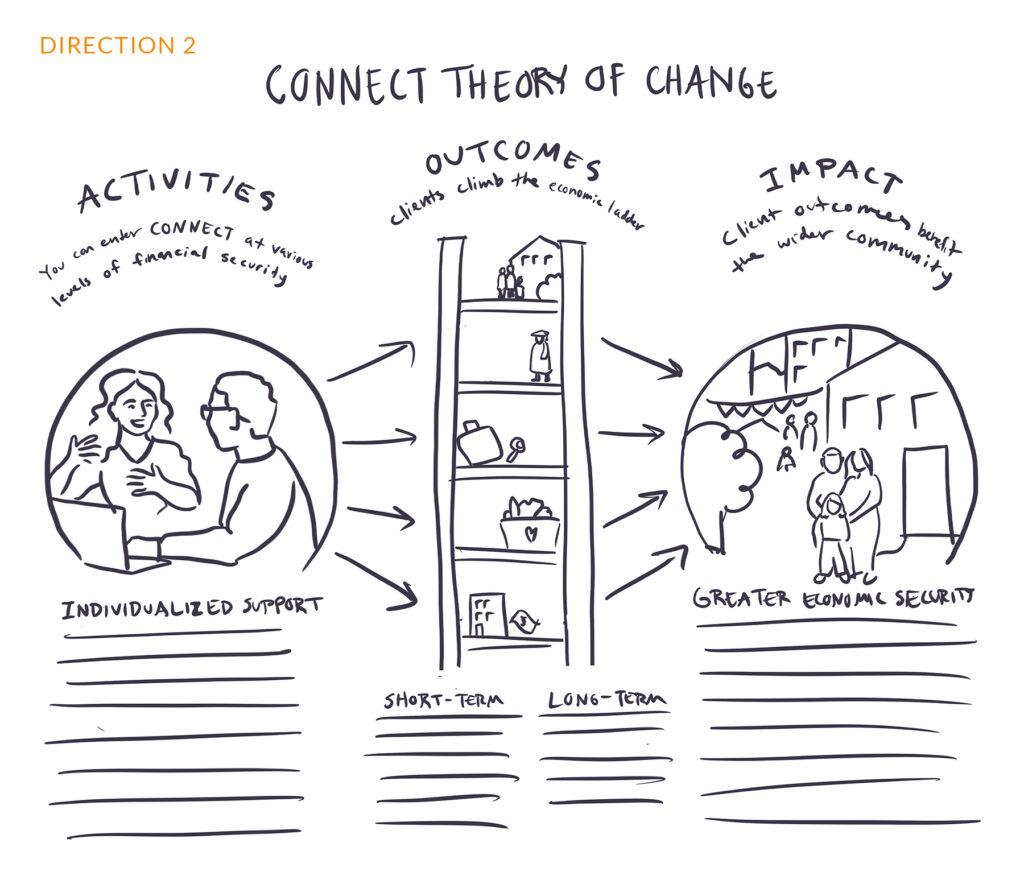
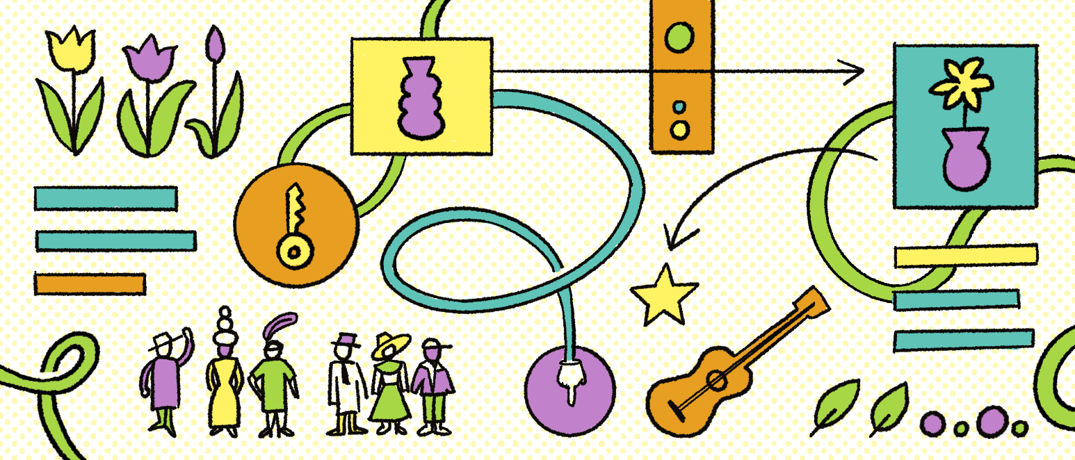
The client liked aspects of both sketches, but eventually decided on the first direction. They liked how it showed that the individual benefit and community benefit were connected. Here’s the final version, with a few additional tweaks:
TND knew these graphics would get a lot of use on their website, grant materials, and even handouts at tabling events, so it made sense for them to invest in graphics that were on brand and highlighted the tone and messaging they wished to convey. Do you have a similar need? If so, send me a message to start a conversation.