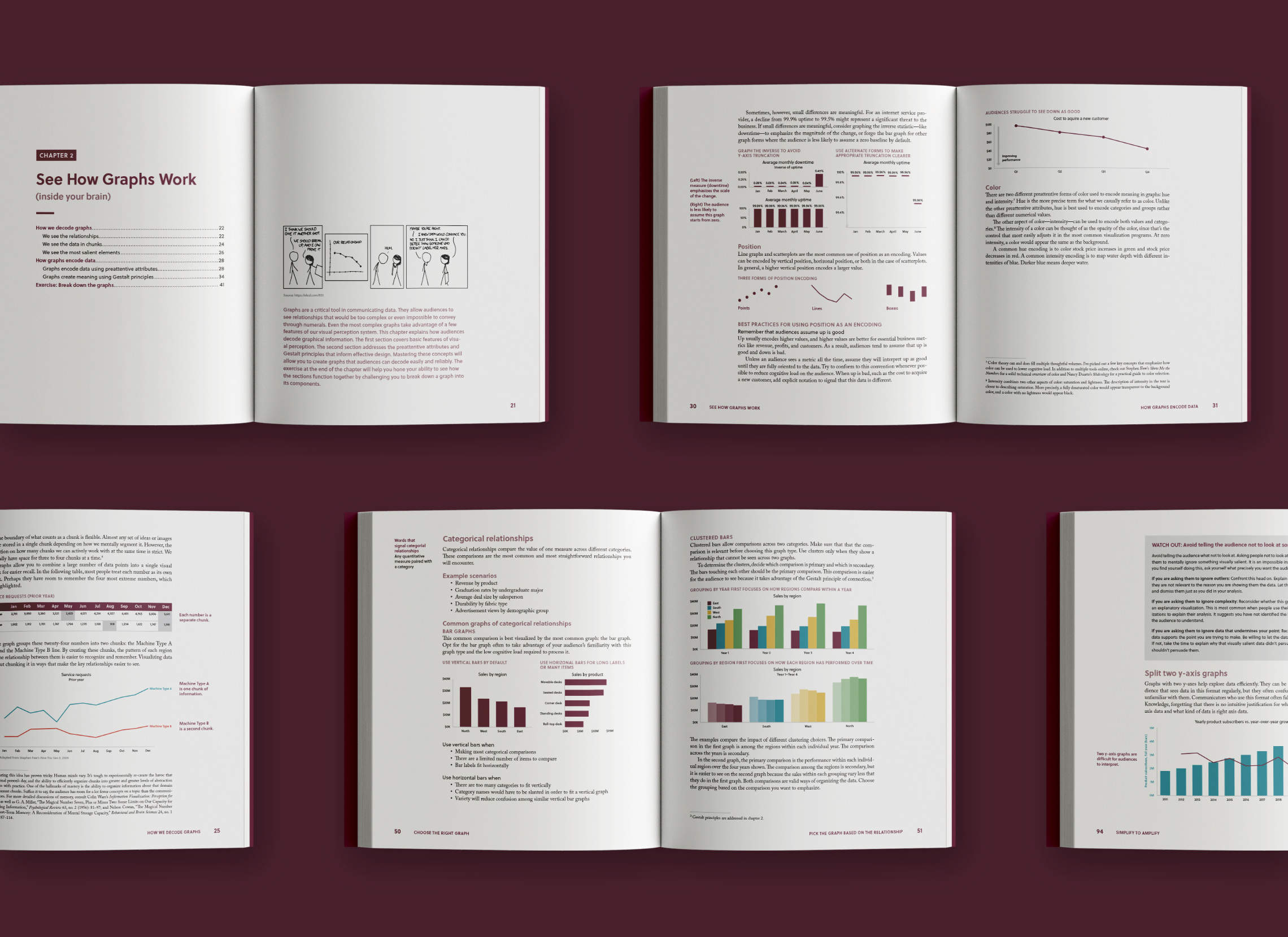
Over the course of a year and half, we worked closely with author Miro Kazakoff and the team at MIT Press to provide both art direction and design production for Persuading with Data. This book, geared towards business school students as well as professionals, provides insight into the common pitfalls of communicating data, along with tools and best practices to communicate more effectively.
Persuading with Data
Design and layout for an academic book

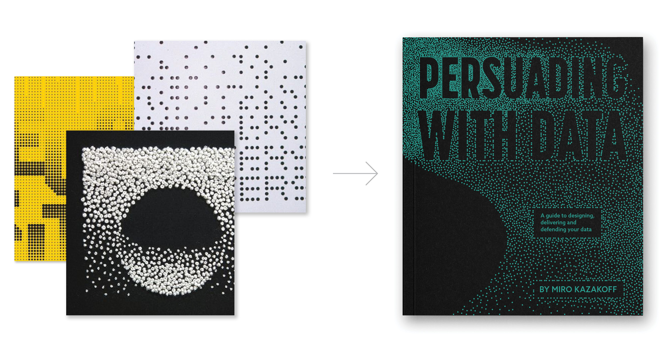
We initially presented two creative directions for the book’s look and feel. The first direction (below) explored the concept of many small points creating a bigger picture.
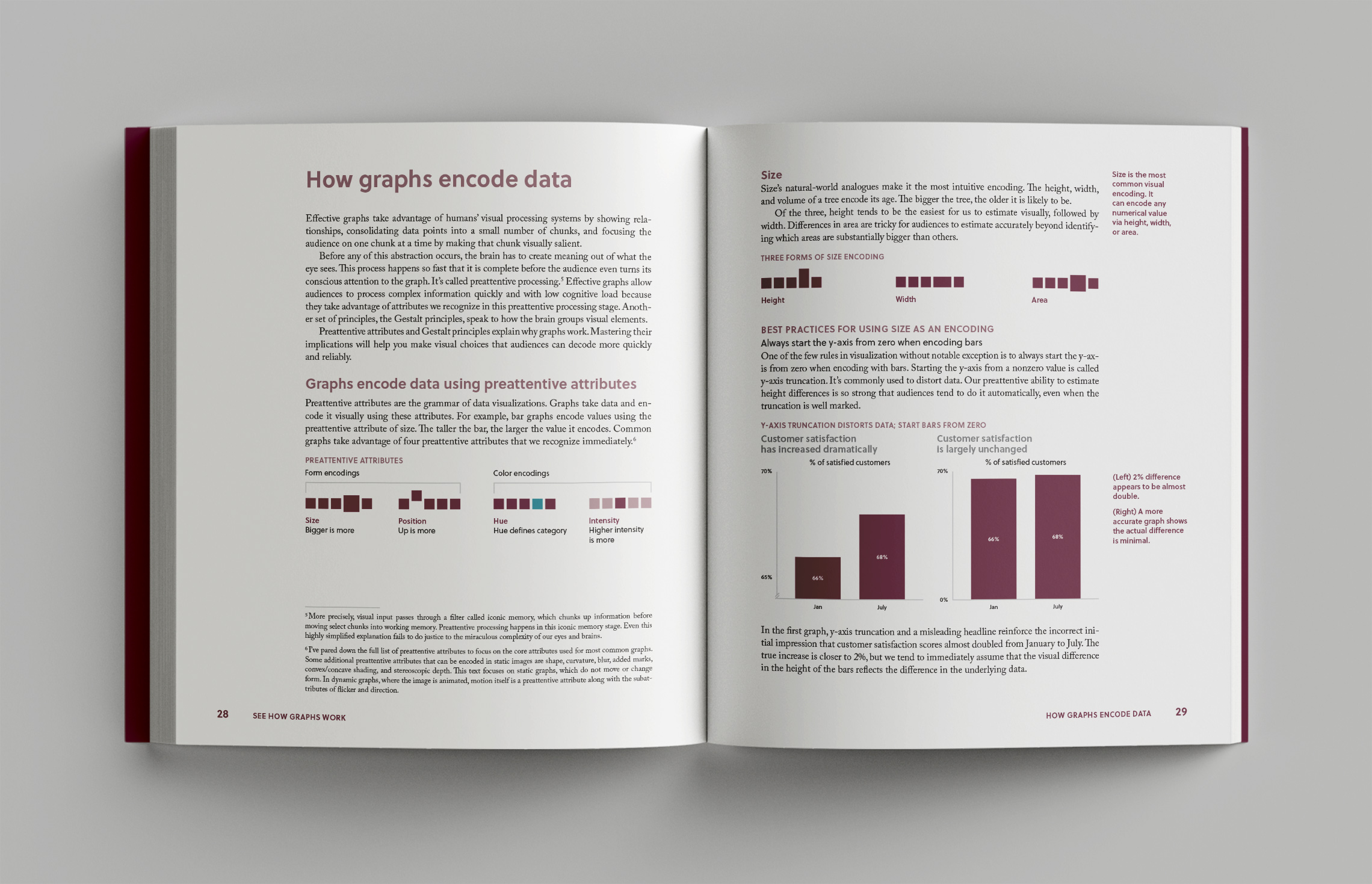
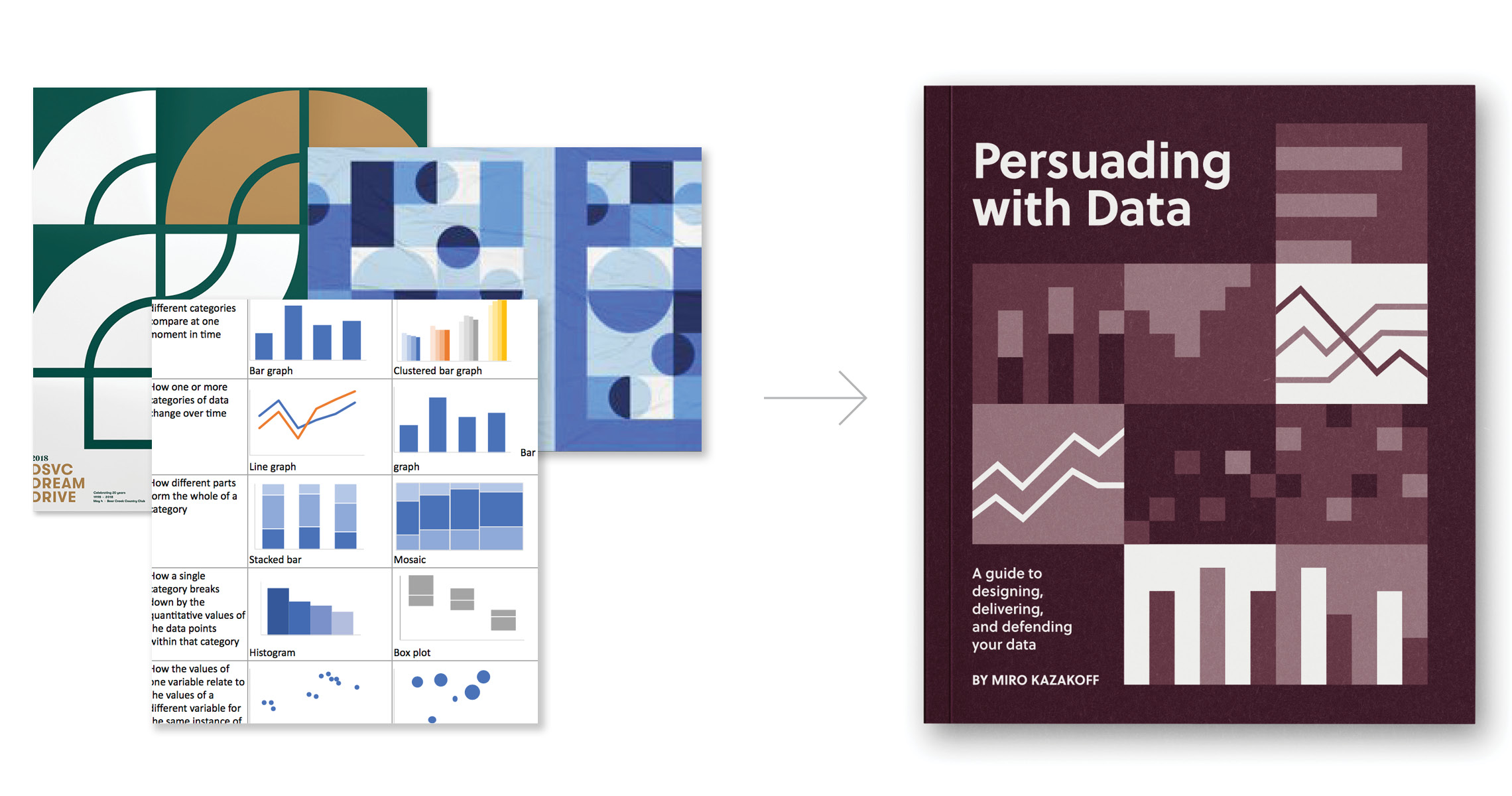
The second direction took a modular approach inspired by clean, geometric shapes and the forms of the graphs represented in the book. The author ultimately chose this direction because the simplicity and purposefulness of the design reflected his approach to data communication. The burgundy color palette helped Persuading with Data stand out from other books in the same space.
Once the creative direction was finalized, the hard work began of recreating over 150 of the author’s charts and graphs in a consistent style and size. We then tackled the 264 page layout, carrying the purposeful, minimalist style throughout.
